

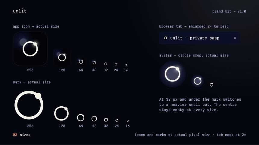
Brand systems and the front-end they live on. Three identities below, shown exactly as delivered — down to the 16‑pixel favicon.
Most people do one or the other, so the logo and the website end up looking like two different companies. I build the system and the front-end together — which is the only way it stays consistent once the thing is actually live.
Each one is the real delivery: the guideline pages and export files the client received. No mockup renders.

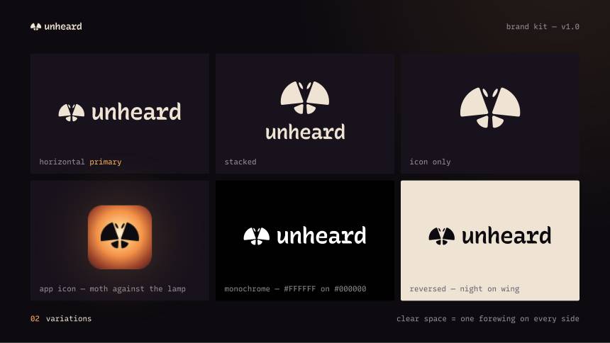
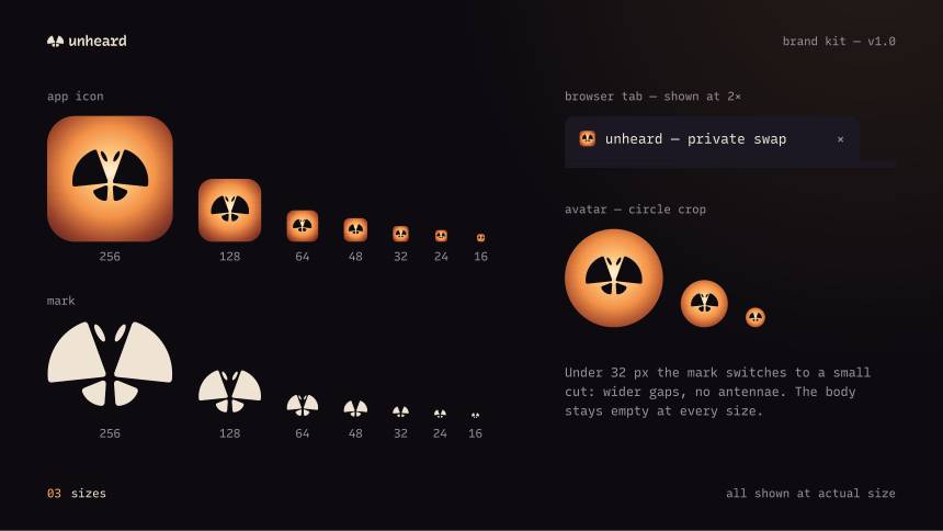
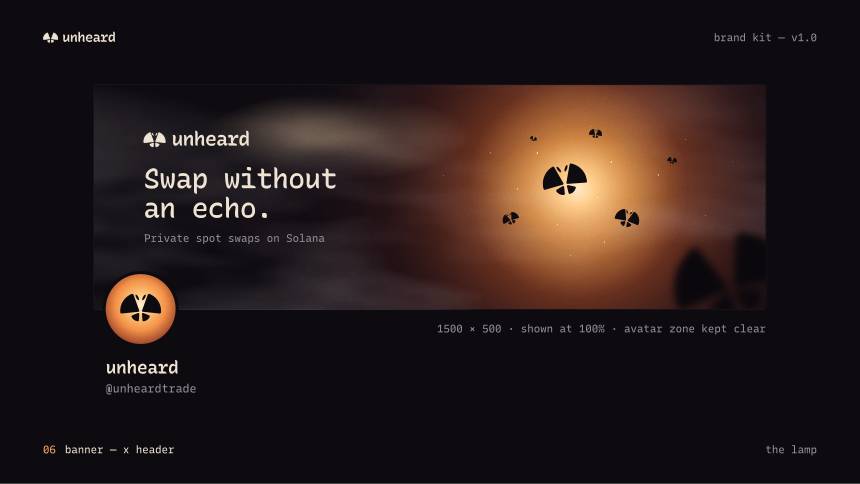
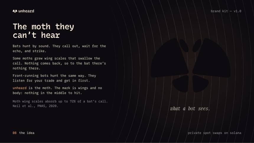
Some moths have scales that absorb a bat’s sonar, so the pulse goes out and nothing comes back. That is the whole product in one image: a swap that leaves no echo.
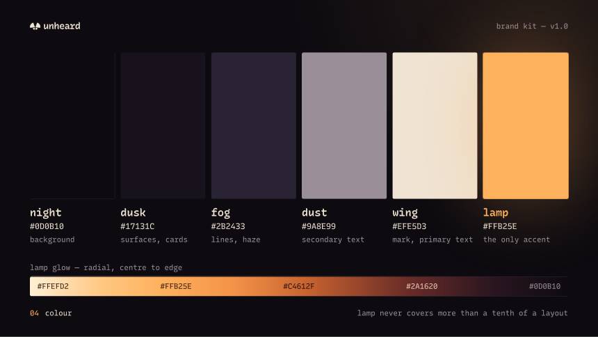
The mark is that moth reduced to a single symmetrical shape — no eyes, no antennae, no detail that dies below 24 px. Amber on near-black, because the one warm accent has to survive a dark interface.

 64
64 48
48 32
32 16
16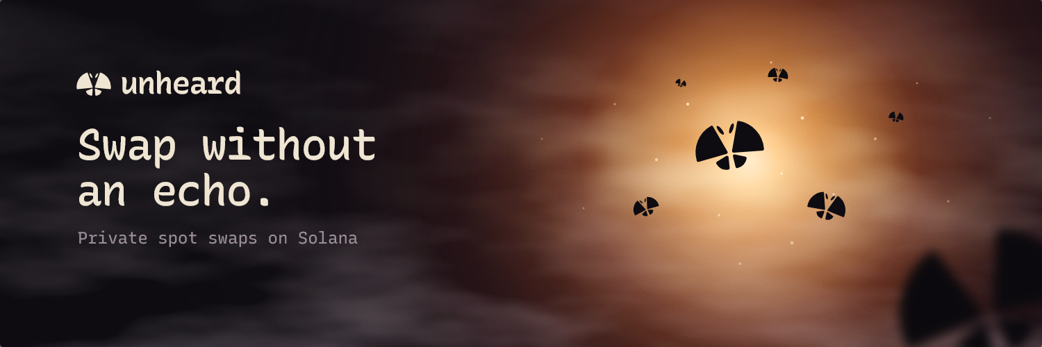

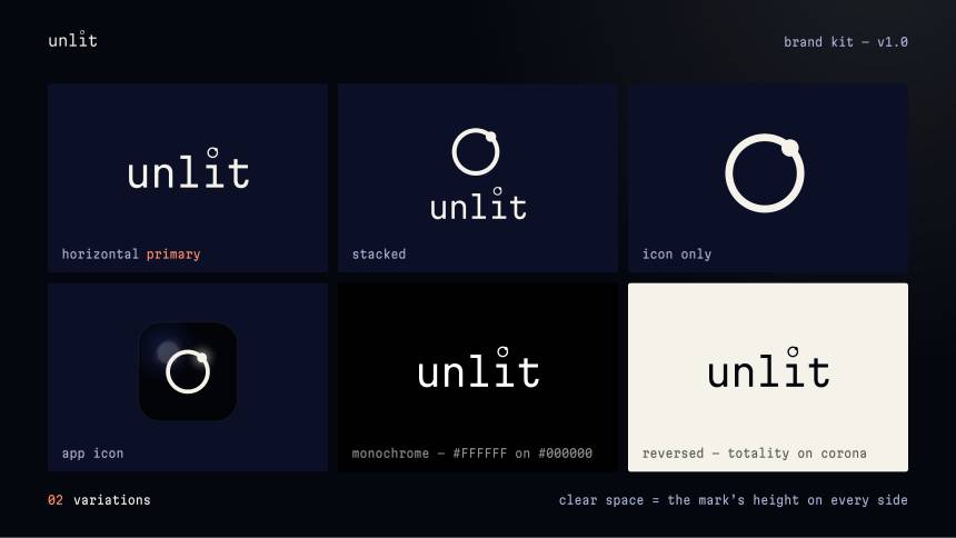
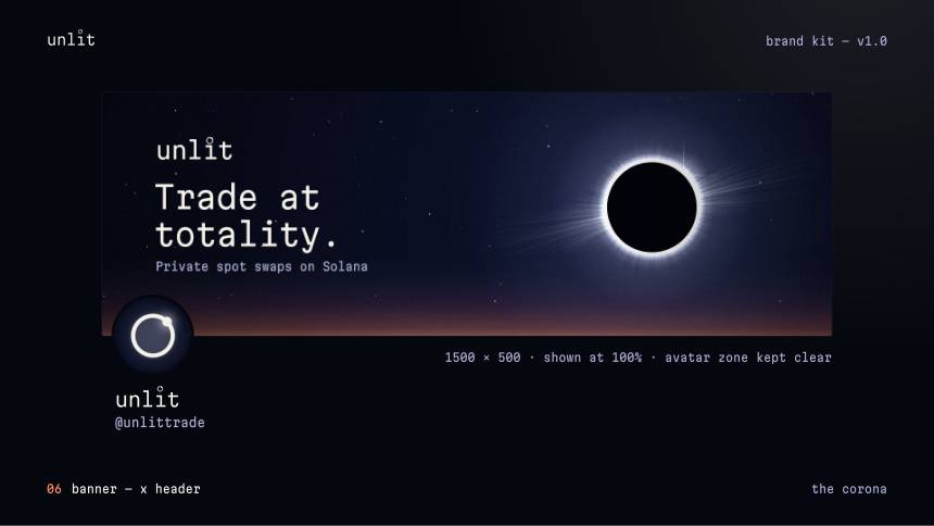
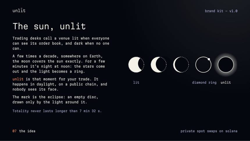
Totality lasts a few minutes and the sun is still there the whole time — just unreadable from where you stand. One circle covering another, nothing else in the mark.
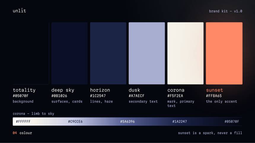
The palette runs deep sky to corona, so the brand has somewhere to go between a dark interface and a single warm highlight. The phases double as a loading state and a section divider.


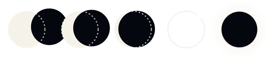
One circle passing over another — the same motion the mark is built on, used wherever the interface has to wait.
 64
64 48
48 32
32 16
16

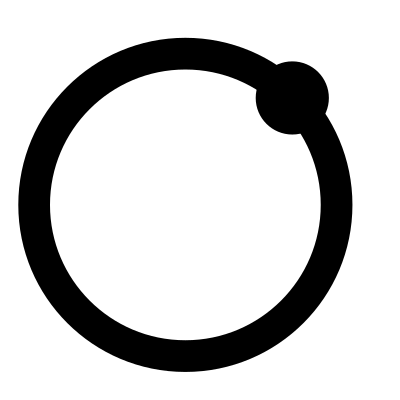
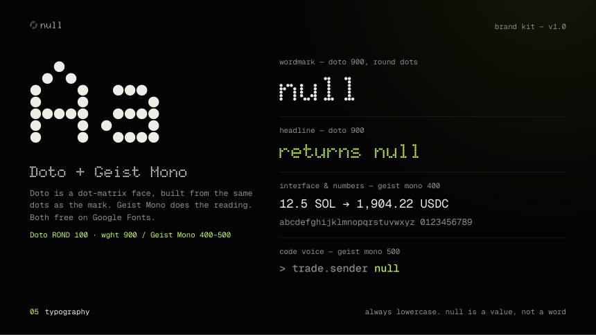
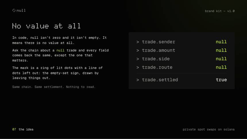
In code, null is not zero and it is not empty — it means there is no value at all. Ask the chain about a null trade and every field answers except the one that matters.
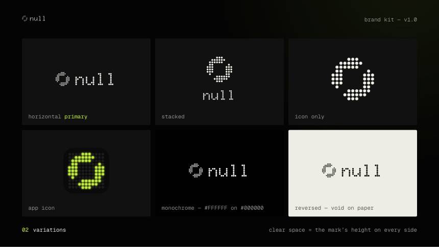
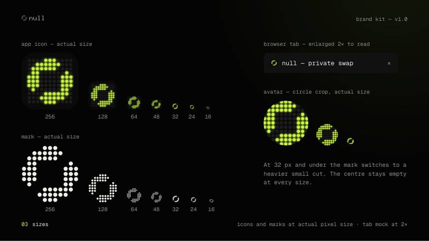
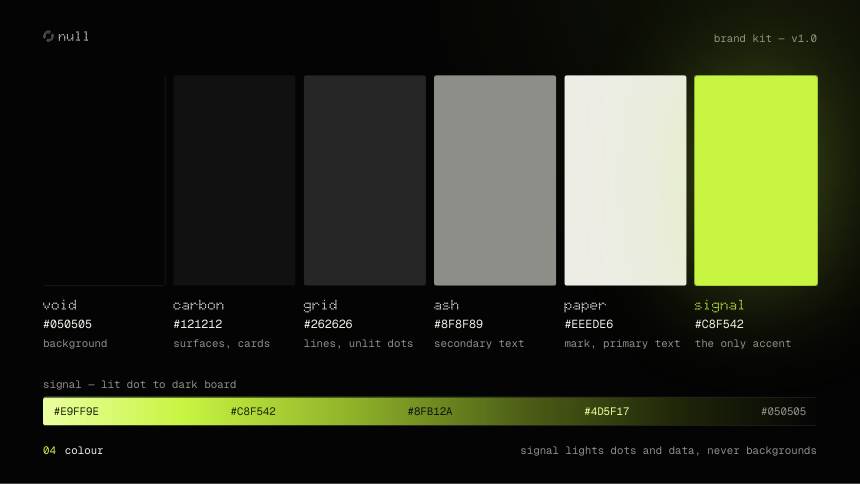
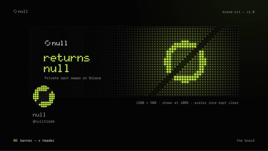
The mark is a ring of lit dots with one line of dots left out: the empty-set sign, drawn by the data that is missing. Signal lime lights dots and figures, never a background.




 64
64 48
48 32
32 16
16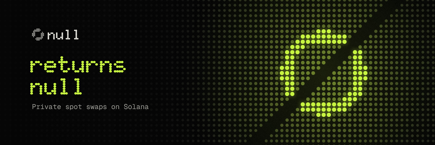
04 — Working together
Three brand systems, shown as the client receives them — the real delivery pages and the real export files, not filtered through mockup renders.